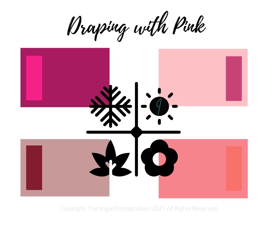
Draping with Pink
Will the Pink Drape in your kit be the most used this summer? From pastel pink to the brightest fuchsia – there is a shade of pink that will suit everyone. Which is just as well, because thanks to the launch of the Barbie movie, pink is the trending colour for summer 2023.

The colour pink takes its name from the flower of the same name – from the Dianthus family. It was first used as a colour name in the late 17th century and is a pale red colour.
Although it’s a colour that can be more difficult to wear if you have an autumn skin tone, happily, there is a shade that will suit everyone.
In the Colour Kit provided with our training course you have 4 shades of pink drape – one for each season. When draping with pink, during a colour analysis, the powder pink drape of summer, will look quite good on a winter, being primary red mixed with white. But the winter pink drapes are very severe on a summer. You may find it useful to compare the two if you are unsure whether a client is summer or winter. Summer and winter skins will take on a slightly sallow look with the spring and autumn warm pink drapes.
Summer pink can be worn by the spring skin tone, but tends to look rather bland compared to their own coral or peach. They are usually fond of pink and often like it on themselves.
The winter deep hot pink or fuchsia, is another colour that is unflattering on the other seasons, but can be better than other winter shades. It is frequently very popular with springs, who can be quite disappointed when they see how aging it can be and how it intensifies and makes their skin appear blotchy.
Spring clients will look so good in the peach and coral drapes and it can be difficult to show them they can also wear autumn muted peach, as they usually look rather paled in it by comparison.
Find out more about Colour Analysis in our article Seasonal Colour Analysis 101
Follow us on Pinterest
Follow us on FaceBook
#pinkdrape #barbiepink #summer2023
